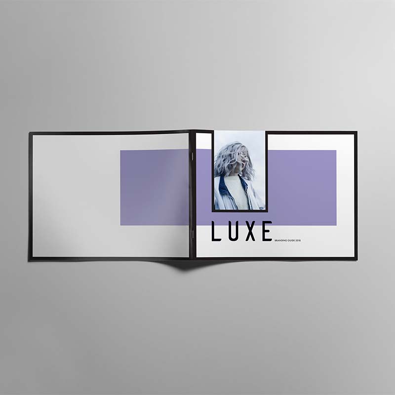
Re-branding
LUXE Spa
A re-branding package for LUXE Spa located in Carlington, Ottawa.

Audience
Middle-class women.
Insight
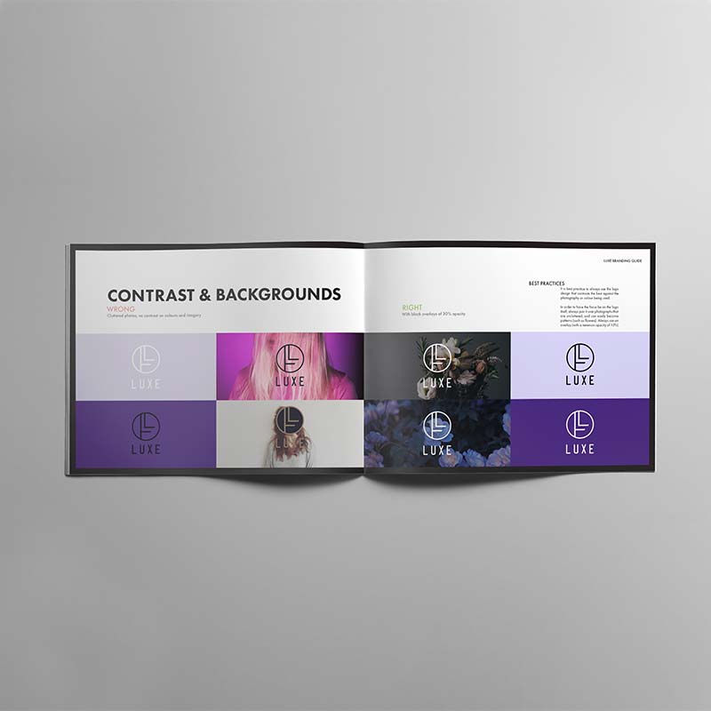
The goal of this logo redesign was to portray Luxe’s quality in services, and renown artistry to Ottawa and its surrounding cities. This newly created logo was carefully curated to bring a sense of modernism, which was highly influenced by the Art Deco style. This logo is timeless, adaptable, and straightforward.
Before
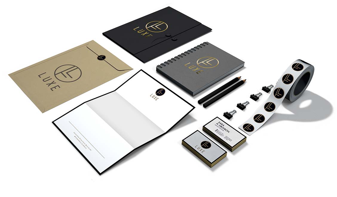
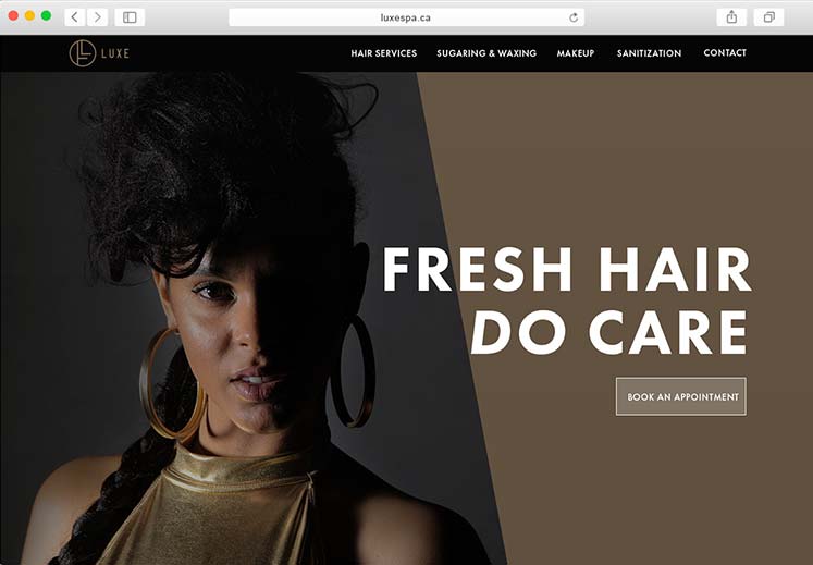
After
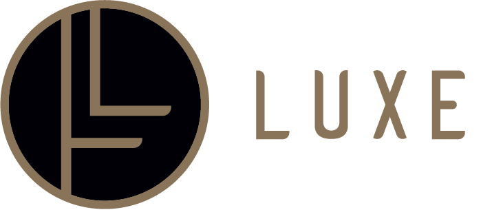
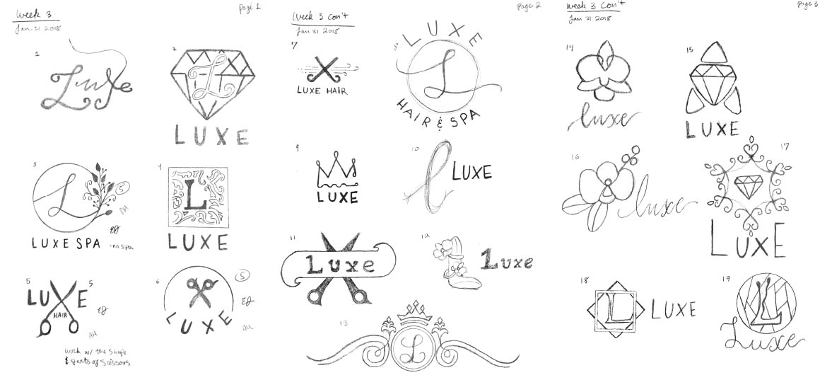
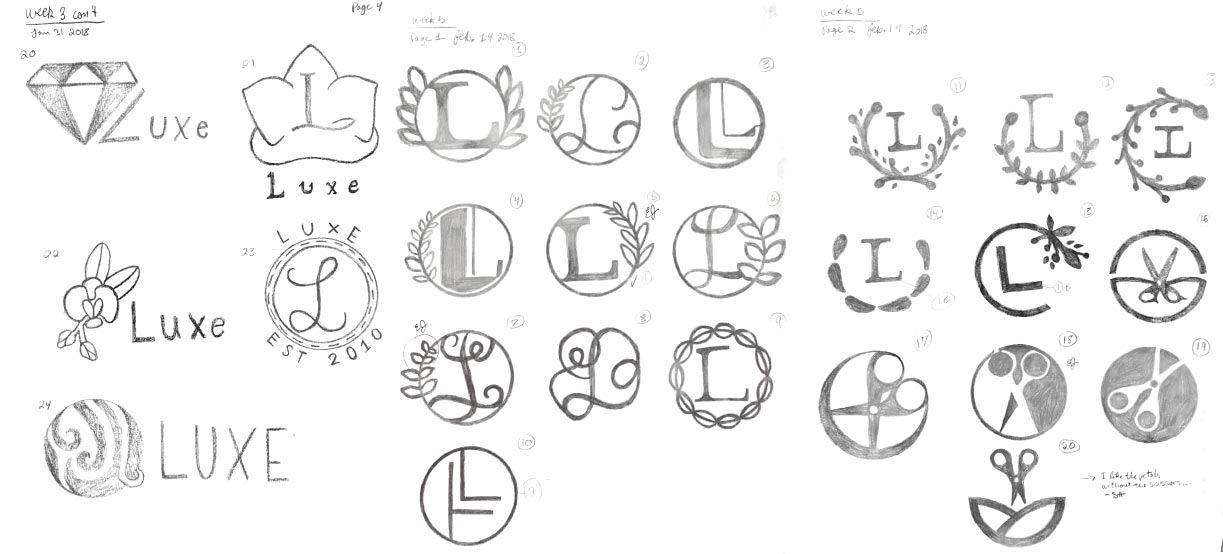
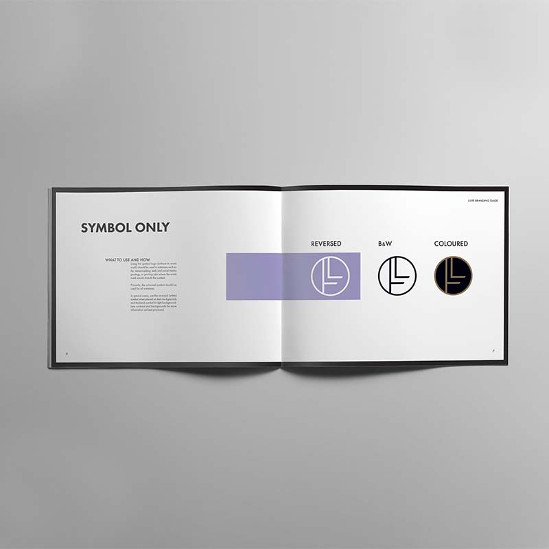
Deconstructing the logo
To portray the essence of elegance—which plays a crucial part in Luxe’s current presence—the logo was designed in solid, clean lines. It primarily consists of breathable space, contemporary bezels, and a classic colour palette. Gold, which is appropriately associated with luxury, pairs beautifully with the rich black at its centre. To evoke the senses of sophistication, formality, and class, a deep black was selected to create balance. All of these elements combined, the logo successfully emanates to Luxe’s clientele the feeling of grandness, lavishness, and openness.